Client Overview:
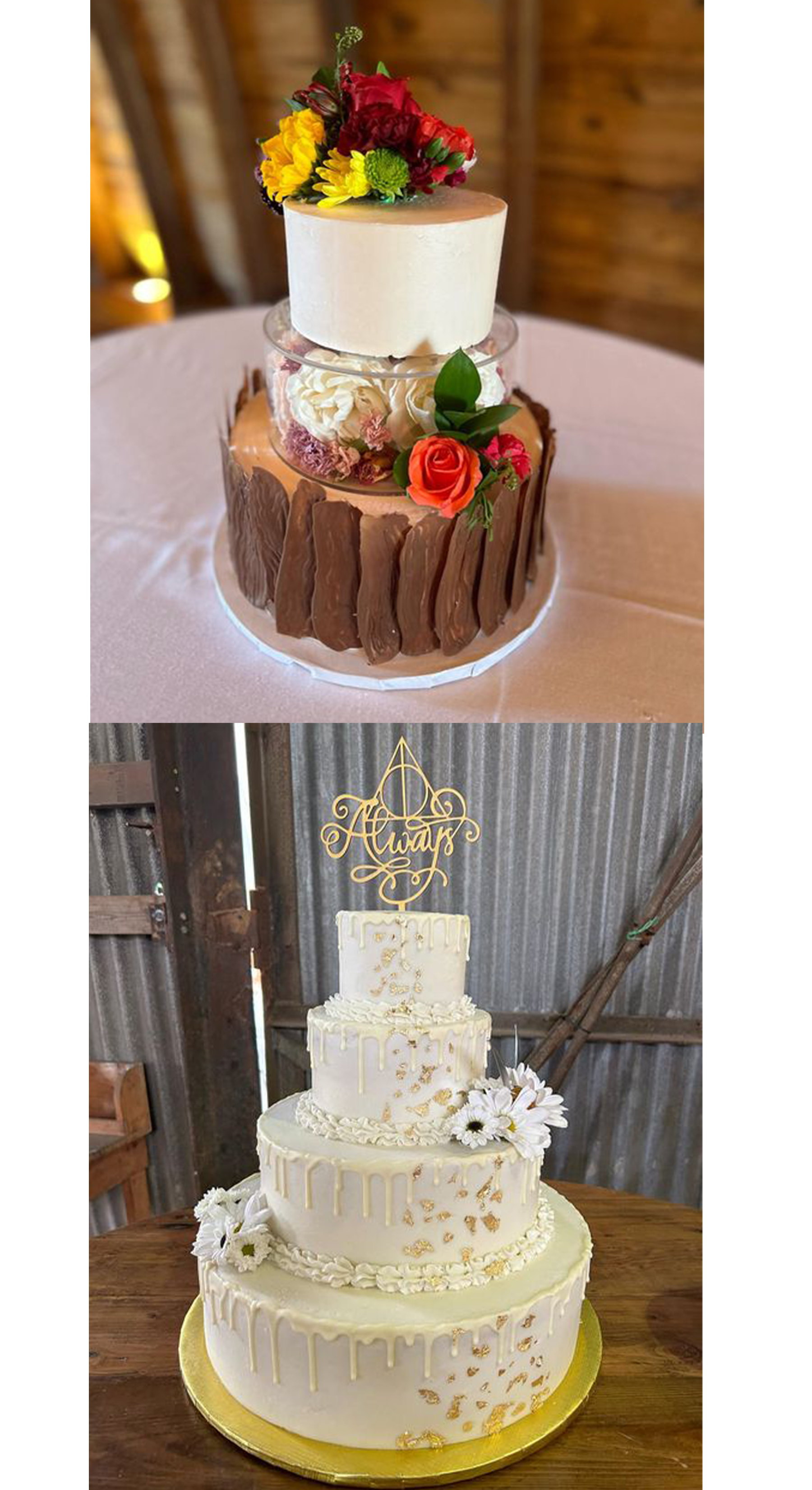
Junebug Pastries, a vibrant and woman-owned business based in Pittsburgh, is the creative venture of a passionate baker. Specializing in a delightful array of pastries, from cakes to cookies, Junebug Pastries embodies the spirit of homemade goodness and personalized culinary artistry.
Junebug Pastries, a vibrant and woman-owned business based in Pittsburgh, is the creative venture of a passionate baker. Specializing in a delightful array of pastries, from cakes to cookies, Junebug Pastries embodies the spirit of homemade goodness and personalized culinary artistry.
Design Concept:
The logo, brand, and identity for Junebug Pastries aim to reflect the heart and soul of this unique, one-woman show. The central theme revolves around the warmth of homemade pastries and the whimsical charm of a buzzing Junebug. The intention is to evoke a sense of joy, nostalgia, and the personal touch that defines Junebug's delectable creations.
The logo, brand, and identity for Junebug Pastries aim to reflect the heart and soul of this unique, one-woman show. The central theme revolves around the warmth of homemade pastries and the whimsical charm of a buzzing Junebug. The intention is to evoke a sense of joy, nostalgia, and the personal touch that defines Junebug's delectable creations.
Color Palette:
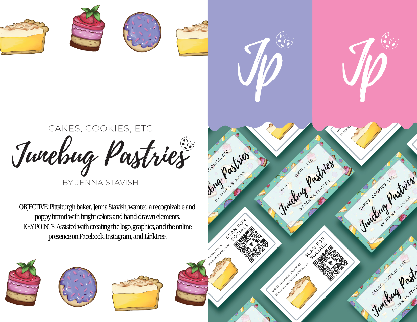
Embracing the bright and colorful nature of the brand, the color palette features a playful array of pastel hues. Each color is carefully selected to convey a sense of freshness, positivity, and the delightful variety found in Junebug's pastries. The vibrant colors extend the brand's personality across various touchpoints, creating a cohesive visual identity.
Embracing the bright and colorful nature of the brand, the color palette features a playful array of pastel hues. Each color is carefully selected to convey a sense of freshness, positivity, and the delightful variety found in Junebug's pastries. The vibrant colors extend the brand's personality across various touchpoints, creating a cohesive visual identity.
Illustrations:
Illustrated pastries take center stage in the brand's visual language. Cupcakes, cookies, and cakes, each uniquely crafted, serve as delightful accents on the website, business cards, and promotional materials. These illustrations not only showcase the range of Junebug's offerings but also add a whimsical and personalized touch, emphasizing the artisanal quality of the pastries.
Illustrated pastries take center stage in the brand's visual language. Cupcakes, cookies, and cakes, each uniquely crafted, serve as delightful accents on the website, business cards, and promotional materials. These illustrations not only showcase the range of Junebug's offerings but also add a whimsical and personalized touch, emphasizing the artisanal quality of the pastries.
Typography:
The typography chosen for Junebug Pastries strikes a balance between playfulness and elegance. A custom font adds a personal touch to the brand's name, while a complementary typeface ensures clarity and readability across all applications.
The typography chosen for Junebug Pastries strikes a balance between playfulness and elegance. A custom font adds a personal touch to the brand's name, while a complementary typeface ensures clarity and readability across all applications.